

Edit | Leave a Comment | Favorite
More Like This: (Beta Temporary Feature)


User Comments:
Lurkerella commented at 2011-06-19 22:12:52 » #778777
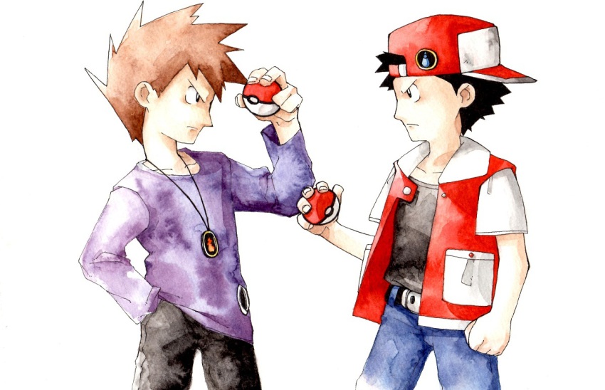
Is this by Sugimori? Both style and messy watercolour looks like Sugimori early 90s style (a.k.a. the days he drew like shit, lol).
Man, Sugimori improved a lot... Anatomy, coloring, composition and overall style.
Go Bulbapedia and compare the early characters like Red or Green oldest artworks with the newest ones and surprise yourselves.
 6 Points
 Flag
Flag
Is this by Sugimori? Both style and messy watercolour looks like Sugimori early 90s style (a.k.a. the days he drew like shit, lol).
Man, Sugimori improved a lot... Anatomy, coloring, composition and overall style.
Go Bulbapedia and compare the early characters like Red or Green oldest artworks with the newest ones and surprise yourselves.
Flag
Anonymous commented at 2011-06-19 23:41:30 » #778884
The art improved but it lost personality. Look at character art for HeartGold and SoulSilver, the expressions on their faces are just kinda wide and lifeless. As though they were just showing their expressions, not feeling it.
It has a bit of a mass produced, plastic feel to it.
And then some of the characters are just strange, though I'm not sure if that was caused by Sugimori or some other possible character designer.
4 Points
Flag
The art improved but it lost personality. Look at character art for HeartGold and SoulSilver, the expressions on their faces are just kinda wide and lifeless. As though they were just showing their expressions, not feeling it.
It has a bit of a mass produced, plastic feel to it.
And then some of the characters are just strange, though I'm not sure if that was caused by Sugimori or some other possible character designer.
Flag
Anonymous commented at 2011-06-19 23:49:53 » #778894
I agree with anon 2. I definitely prefer the old Sugimori stuff to his new artwork. It had a certain sloppy uniqueness to it that just screams "Pokemon" to me whenever I see it. He seems to have settled into a more generic style that, while visually clean, lacks character and feels generic. He's also starting to follow the JRPG trend of weird/outrageous character design that wasn't really present in his characters beforehand.
1 Points
Flag
I agree with anon 2. I definitely prefer the old Sugimori stuff to his new artwork. It had a certain sloppy uniqueness to it that just screams "Pokemon" to me whenever I see it. He seems to have settled into a more generic style that, while visually clean, lacks character and feels generic. He's also starting to follow the JRPG trend of weird/outrageous character design that wasn't really present in his characters beforehand.
Flag
Lurkerella commented at 2011-06-20 02:56:46 » #779049
I would agree with him if it wasn't because of the fact that Sugimori has always draw as lifeless as he does today, but worst because his old drawings had same-face syndrome and even same-body syndrome among those of the same age range...
If you see only a faceshoot you wouldn't tell Green and Red apart because he didn't even bothered to use different skin tones (even Brock was white, LOL) or even eye shape or colour (all his characters had black eyes done with a line shaped pupil).
But I can agree that his character designs are getting ridiculous, specially hairstyles... I'm still trying to figure out how Iris hair works.
Did I mention he only makes characters over white backgrounds? He can't make a background even if his life depended on that. Sometimes he just paste the characters over photographies, lol.
The other Game Freak artist are way more talented than him, but he is the Art Director and everyone mimics his style so he gets all the credit:
bulbapedia.bulbagarden.ne...Battle_Subway_artwork.png
bulbapedia.bulbagarden.ne...rontier_Brain_artwork.png
bulbapedia.bulbagarden.net/wiki/File:Distortion_World.png
bulbapedia.bulbagarden.net/wiki/File:Montecorona13jun08.gif
Pokemon movies artist are another highly underrated bunch, just look at those fucking illustrations, sceneries and backgrounds LOOK AT THEM. I simply came buckets.
bulbapedia.bulbagarden.ne...ese_M05_teaser_poster.png
bulbapedia.bulbagarden.net/wiki/File:M05_Deleted_Scene.png <-- Deleted from U.S. release, fuck.
bulbapedia.bulbagarden.ne...:InsideSpaceTimeTower.jpg
bulbapedia.bulbagarden.ne...y_Hale_Teddiursa_Real.png
bulbapedia.bulbagarden.net/wiki/File:Reverse_World.png
And the sceneries on this trailer: www.youtube.com/watch?v=K-6eG-kzqlM
People behind the movies goes so far to living on the place they are using as inspiration for the movie locations to make sure everything is perfect. They spent a time in Barcelona studying Gaudi's buildings for Arceus & The Jewel of Life and sadly all that hard work goes ignored.
Sorry for making this too TL;DR, blame my internal artfag :V
9 Points
Flag
I would agree with him if it wasn't because of the fact that Sugimori has always draw as lifeless as he does today, but worst because his old drawings had same-face syndrome and even same-body syndrome among those of the same age range...
If you see only a faceshoot you wouldn't tell Green and Red apart because he didn't even bothered to use different skin tones (even Brock was white, LOL) or even eye shape or colour (all his characters had black eyes done with a line shaped pupil).
But I can agree that his character designs are getting ridiculous, specially hairstyles... I'm still trying to figure out how Iris hair works.
Did I mention he only makes characters over white backgrounds? He can't make a background even if his life depended on that. Sometimes he just paste the characters over photographies, lol.
The other Game Freak artist are way more talented than him, but he is the Art Director and everyone mimics his style so he gets all the credit:
bulbapedia.bulbagarden.ne...Battle_Subway_artwork.png
bulbapedia.bulbagarden.ne...rontier_Brain_artwork.png
bulbapedia.bulbagarden.net/wiki/File:Distortion_World.png
bulbapedia.bulbagarden.net/wiki/File:Montecorona13jun08.gif
Pokemon movies artist are another highly underrated bunch, just look at those fucking illustrations, sceneries and backgrounds LOOK AT THEM. I simply came buckets.
bulbapedia.bulbagarden.ne...ese_M05_teaser_poster.png
bulbapedia.bulbagarden.net/wiki/File:M05_Deleted_Scene.png <-- Deleted from U.S. release, fuck.
bulbapedia.bulbagarden.ne...:InsideSpaceTimeTower.jpg
bulbapedia.bulbagarden.ne...y_Hale_Teddiursa_Real.png
bulbapedia.bulbagarden.net/wiki/File:Reverse_World.png
And the sceneries on this trailer: www.youtube.com/watch?v=K-6eG-kzqlM
People behind the movies goes so far to living on the place they are using as inspiration for the movie locations to make sure everything is perfect. They spent a time in Barcelona studying Gaudi's buildings for Arceus & The Jewel of Life and sadly all that hard work goes ignored.
Sorry for making this too TL;DR, blame my internal artfag :V
Flag
1